One Room Challenge: Week 4
The past week
has been another fierce round on this emotional design rollercoaster I'm on. However, here’s what I know for sure…
YES,
Things are crazy these days with delays, deadlines, and depletion.
YES,
I’m stressed about the final result and look of my space, and what items will arrive on time.
NO,
I cannot control the aforementioned.
Yes,
I’m going to have a positive outlook, remain focused on what I can control and create, let the rest go, and hope for the best.
So, with that being said…
The challenge is moving along,
and I am starting to pull together the selections I’ve made for my space. One thing to keep in mind when outfitting your room is; matching furniture sets are rarely a great option for any space. They are mass-produced with limiting (if any) style options, and they don’t allow the owner of the space to express who they really are. Mix it up. Get things that you love, and the space will come together. Take a look at some of the things I love, and am using in my One Room Challenge.
Below is a reminder of the layout of my space.
Without professional help, it can be an overwhelming task, trying to design an entire home or office building all at once. Taking on too many spaces at one time, can turn what should be an enjoyable process, into one that is filled with stress and self-doubt. Start small, with one or two rooms, get them fully completed, and then build from there. The sense of accomplishment and design direction from the one or two completed spaces will give you that much-needed boost to propel you through the rest of the design. This is how I approached making selections for my ORC bedroom. I broke down each of the areas that the owner’s suite is comprised of, and I used an initial scheme, as the inspiration for the design in the adjoining rooms. In order to start, I needed a jumping-off point. For this, I used this amazing rug from Loloi.
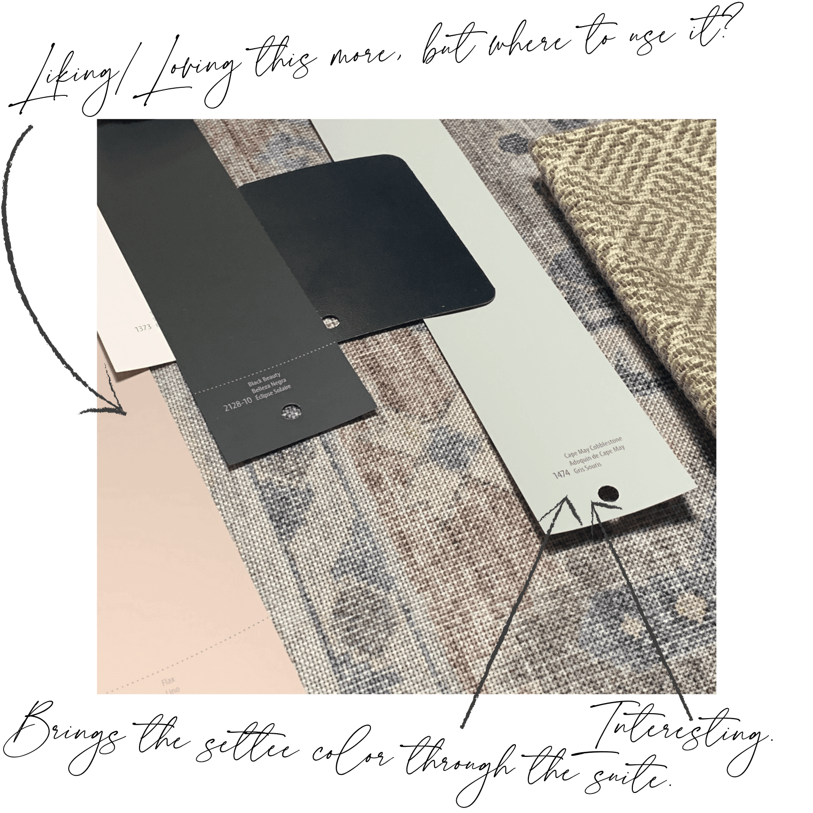
It’s going to ground the space in the main sleeping area. The colors were perfect and the style, while traditionally rooted, has enough transitional moments to mix in with the overall curated look I’m going for. From there I pulled together my wall color palette.
Pulling colors from the rug, and finding their compliments, was the goal. And even though I had a direction to start from; all black everything for the sleeping quarters, I did have some trouble narrowing down the colors. Even down to the blacks (yes there are more than one).
FOUND IT!
Once I found my perfect black for the walls, I was able to narrow down some of my other contenders, checking them against the rug, fabrics, and finishes for the space. Each area of the suite needs to have its own identity but should flow together in its entirety.
It’s all gotta flow…
Each area of the suite needs to have its own identity but should flow together in its entirety.
Color Me Happy
Once these two design staples were in place, I started layering in all the cool and beautiful elements that will make up the entire bedroom suite. What colors did I select? What other items are being used in my design. You’ll just have to come back next week to find out.
So, come back and visit me next week, as we continue on this exciting, challenging (no doubt), and beautiful path to completion! Also, follow my twenty other Featured Design friends, as they take you through the entire process of designing a space over eight weeks. We’ll share behind-the-scenes info, professional tips, and tricks for planning, researching, and selecting elements to help you create a unique, custom room design.
Ariene C. Bethea | At Home With Ashley | Banyan Bridges | Bari J. Ackerman | Brit Arnesen
Brownstone Boys | Cass Makes Home | Dominique Gebru | Gray Space Interiors
Haneen's Haven | Home Ec. | Pennies for a fortune | Prepford Wife |
Rachel Moriarty Interiors | Sachi Lord | Susan Hill Interior Design | This Is Simplicite |


