Before + After | Design Comes to the District
Photography by: Katrina Mojzesz
This has to be one of my all time favorite projects!
...then again every project is a favorite. I was hired by these clients to transform the dining & living room spaces, of a home they, had just moved into with their family. My client made two decisions about the spaces upon moving in; 1, hire me, and 2, have the rooms designed around two works of art, she had spotted, fallen in love with, and purchased. I was certainly up to the challenge. The process was fun, and the final product left this entire family extremely happy. Take a look below at the before and afters of the space, I know you will love the transformation just as much as we (my clients and I) did...and still do!
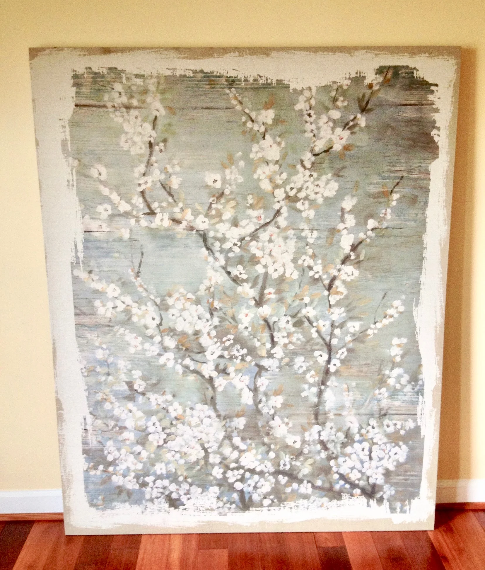
THE STARTING POINT
This is the artwork my client wanted the entire room designed around
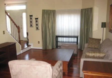
BEFORE | THE LIVING ROOM
This room was standard, disconnected, and cold. As both of my clients are high ranking professionals in their careers, there would definitely be client and/or co-worker dinner parties, social events, holiday soiree's, and much more hosted in these spaces.
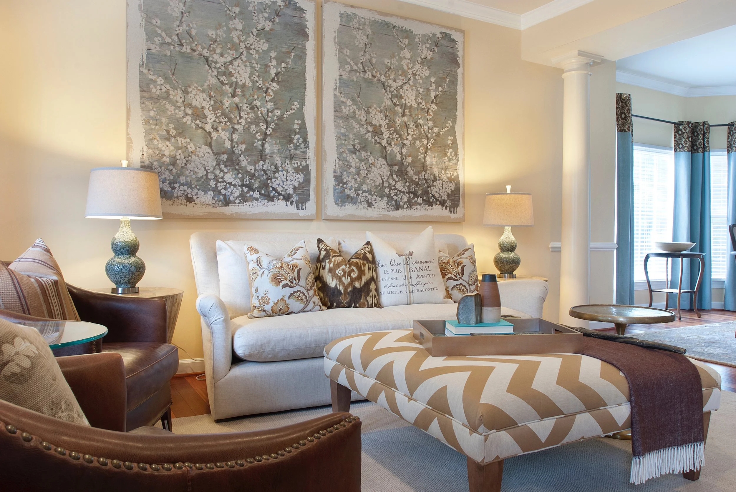
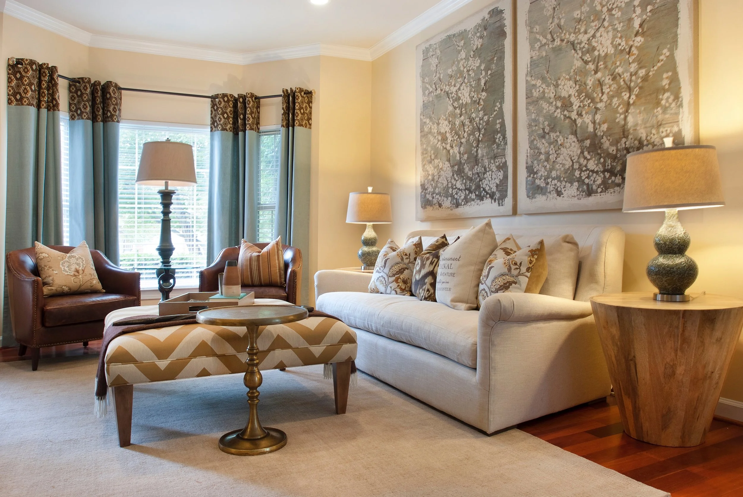
AFTER | THE LIVING ROOM
With the artwork as my guide, I pulled the serene look and feeling from the canvas, and spread it around the room.
Photography by: Katrina Mojzesz
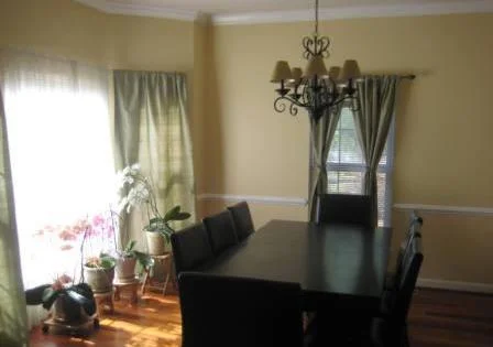
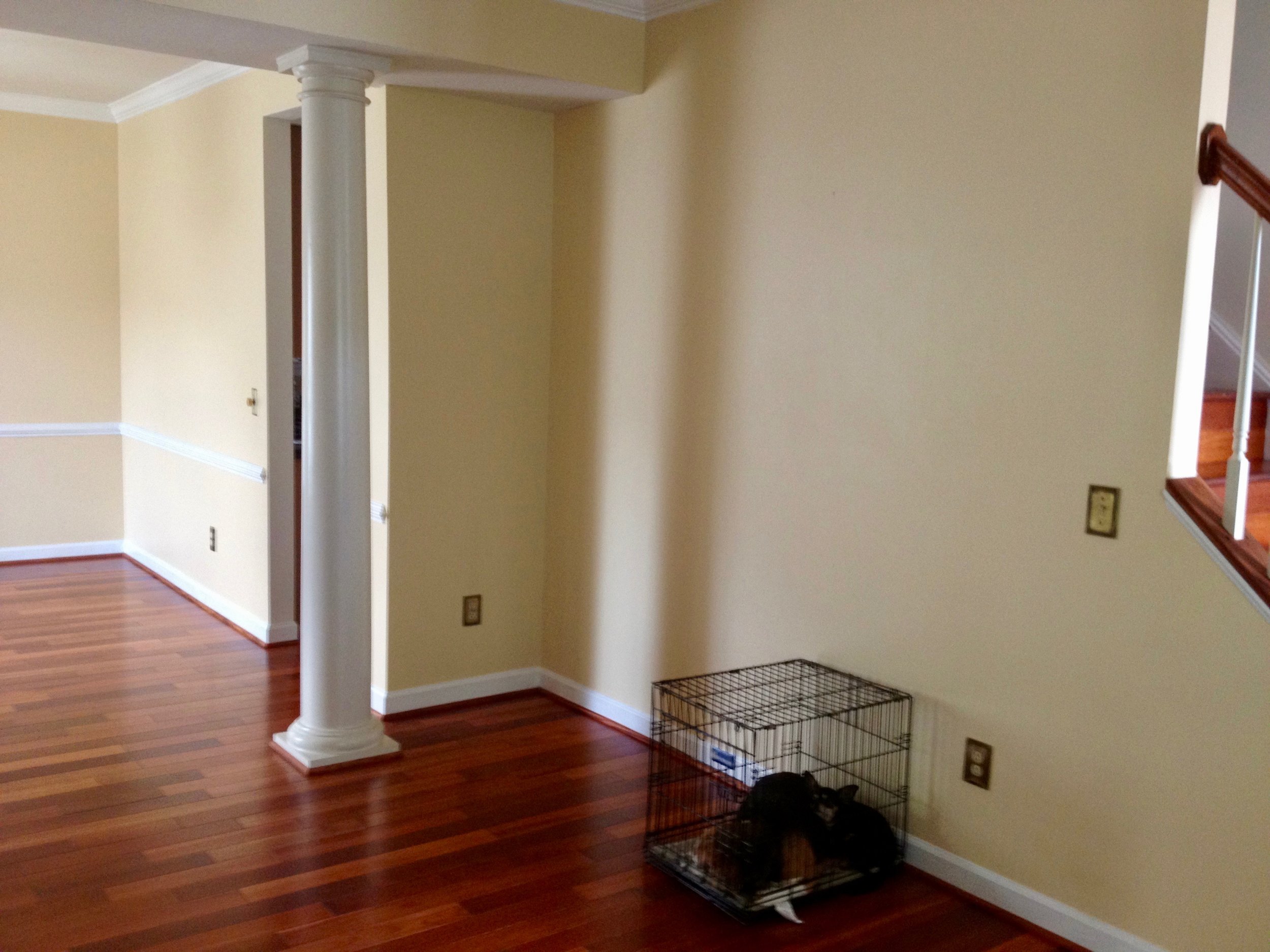
BEFORE | THE DINING ROOM
If this was going to be a place my clients planned to do their "grown folk" entertaining, I had to kick it up several notches, for sure.
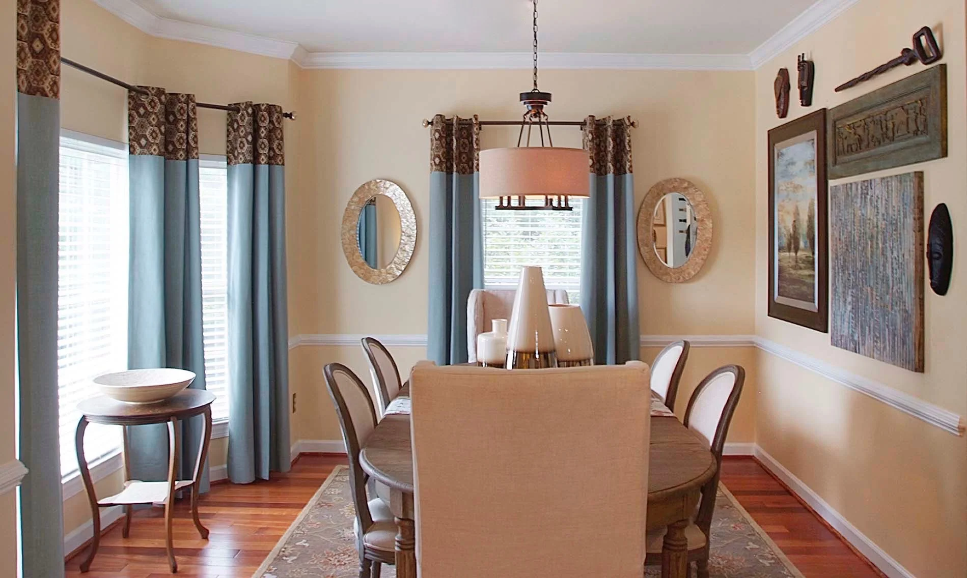
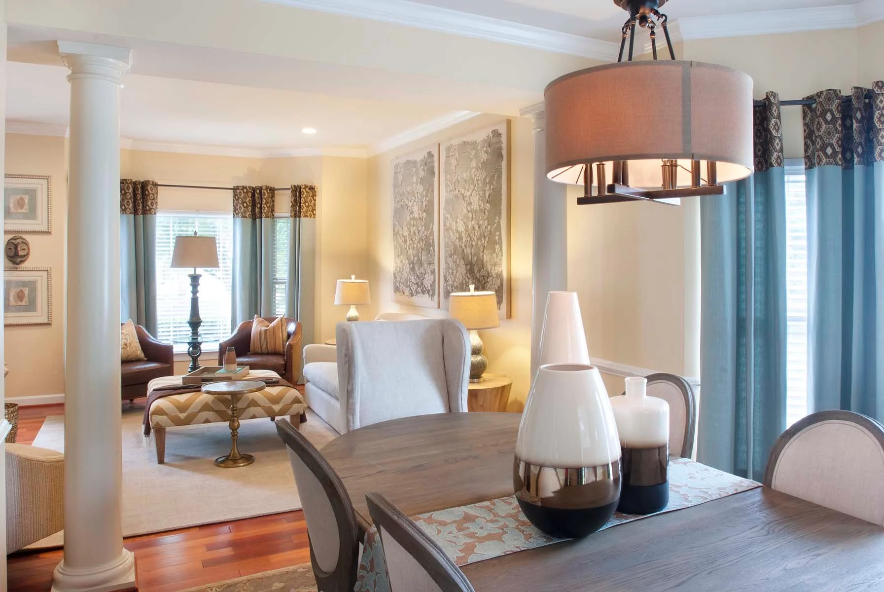
AFTER | THE DINING ROOM
However, above everything else, these two spaces, needed to be comfortable, elevated, and curated, specifically to and for my clients. I incorporated both of my clients into the spaces, through the curation of some of their favorite things, displaying them gallery style on the wall. The first reaction from the lady of the house, when I told her I had agreed to incorporate her husbands African masks and canes in the space? Let's just say it was a little less than enthusiastic.
Photography by: Katrina Mojzesz
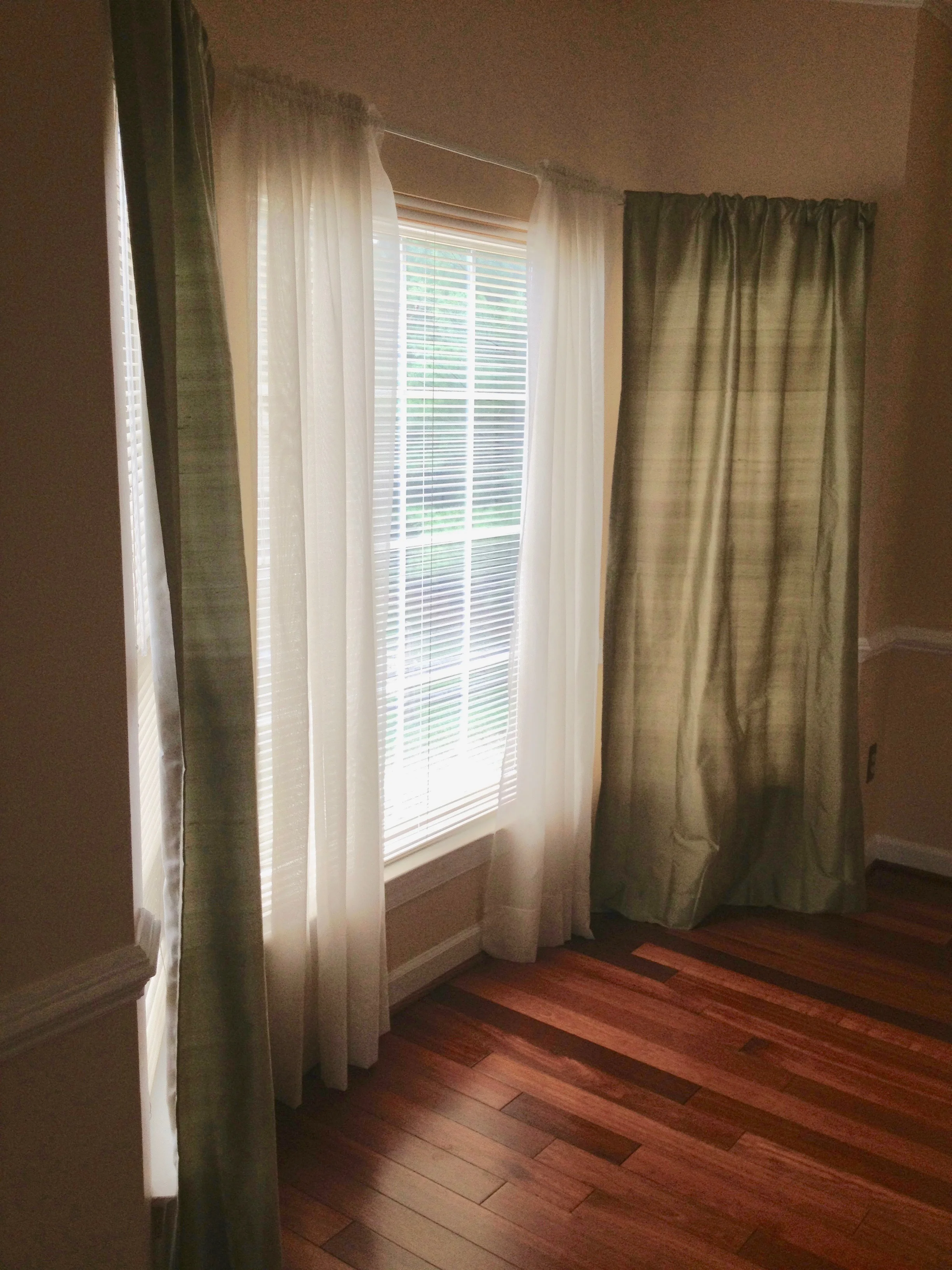
BEFORE | THE WINDOWS
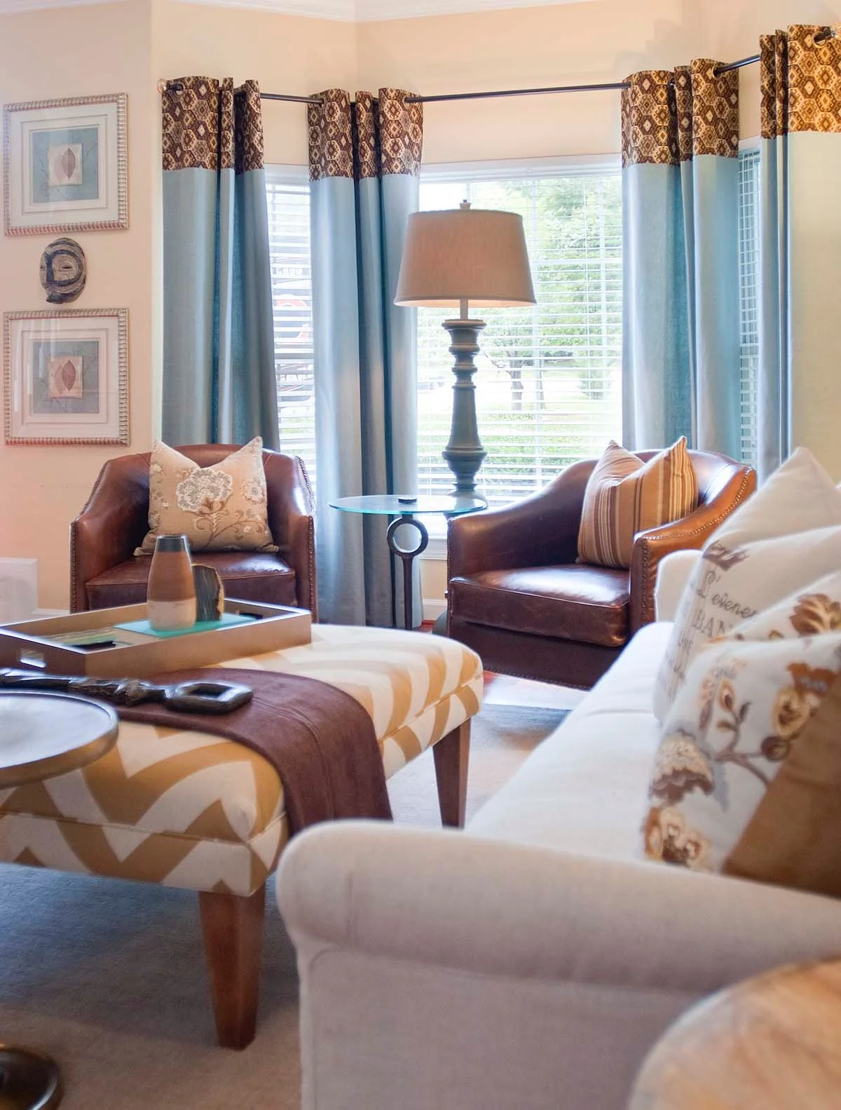
Furniture wasn't the only speed bump on the road to a beautiful room, we encountered. There was also the very underwhelming window treatments.
AFTER | THE WINDOWS
If our eyes, are the windows to our soul, then our windows are our eyes to the world. And there's nothing worse than a dressed up room, with an undressed window. It's just like getting all dressed up to go out, without any jewelry, make-up, and yes, a good lash. Just ask Jamal Buster , Damone Roberts, & Anastasia.
Photography by: Katrina Mojzesz
BEFORE | THE WINDOWS
And it wasn't just the color. It was the style, the hardware, the material, the fullness, the length, it was EVERYTHING!. So, quite naturally everything had to go!
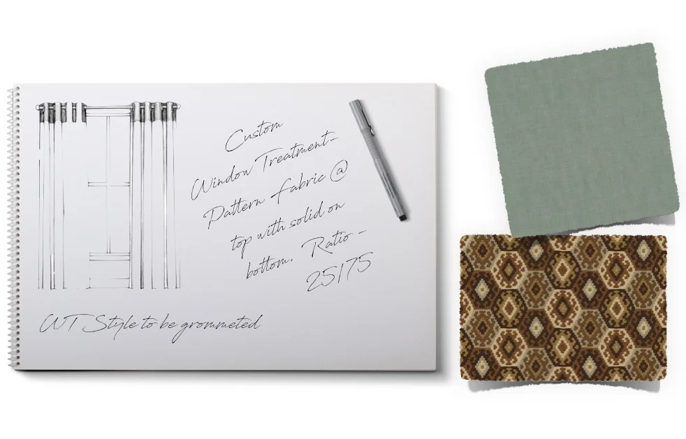
Pattern & Color; my two musts for any space. Tragically (for me), not everyone share's the same sentiment. The creation of the custom window treatments for this project was definitely an exercise in risk taking for my client, and compromise for myself. We used these two fabrics to create a window treatment that found a beautiful landing place, right at the intersection of masculine and feminine, and striking and soft.
AFTER | THE WINDOWS
I never like to get stuck in a specific style or genre when it comes to a space. The fusion of other elements and styles is critical to any interior. It gives the space depth.
Photography by: Katrina Mojzesz
BEOFRE | FINISHING TOUCHES
The Sofa in a well designed space, holds just as much importance as a vase. Accents, Accessories, and other objets should never be an afterthought. They are vital in the successful completion of a beautiful interior. No stone went unturned in the conception and creation of this space.
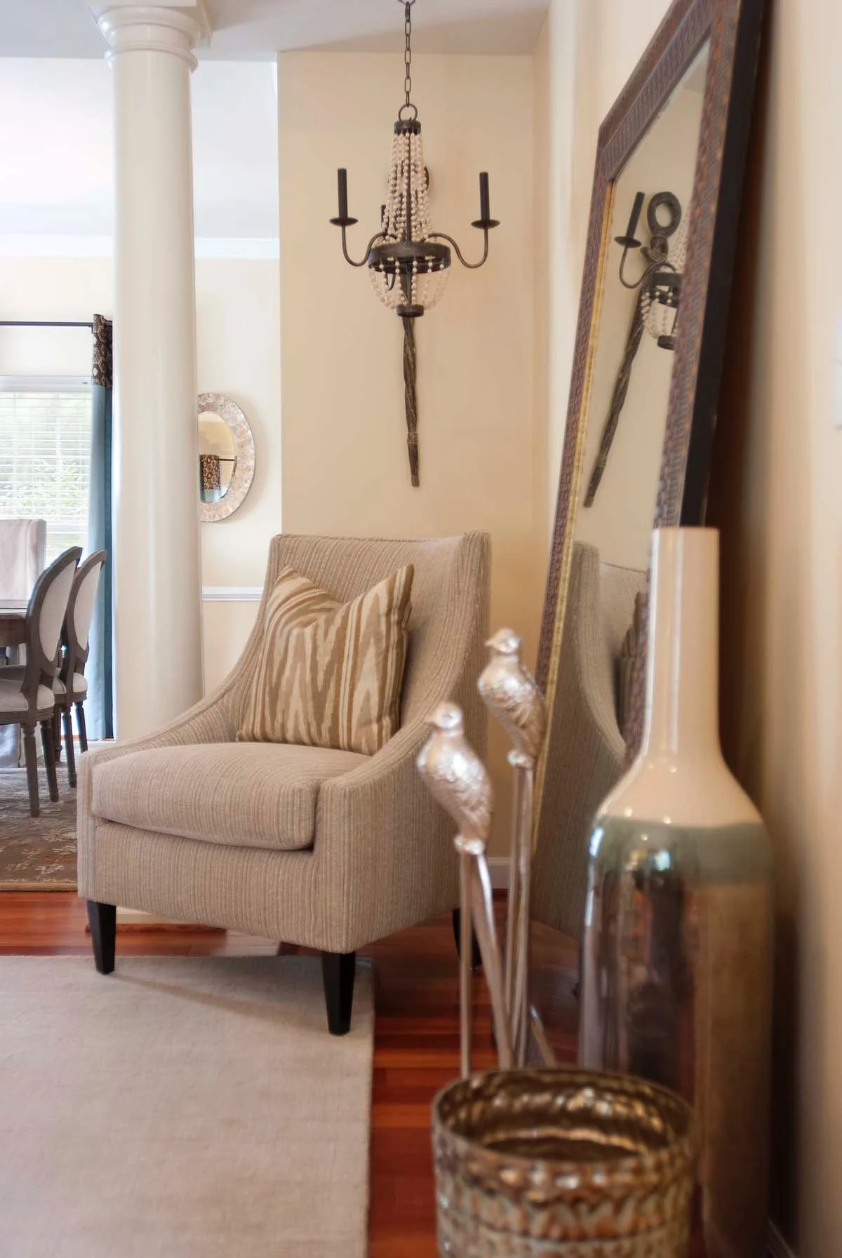
AFTER | FINISHING TOUCHES
No stone went unturned in the conception and creation of this space. It was important to examine every aspect in each of the rooms, never missing any opportunity to create and curate moments where necessary.
Photography by: Katrina Mojzesz
My design intention at the beginning of this project was to provide a space that was luxurious and approachable. A space that was as beautiful feeling, as it was looking. A space that would fill them with joy, when they entered, and would keep them inspired, as they stayed. A space where my clients could retreat after a long day of work. A space, custom built, for their custom lifestyle, reflecting who they were, and how they lived, individually, and jointly. A space that was comfortable, elevated, and curated.
Is your space next on the list for a beautiful transformation? Let’s get started today.

